Resident Evil 3: Killing Nemesis (Level Design and Movement)
November 3rd, 2017
Having extensively researched Resident Evil: Code Veronica‘s level design last year, I set myself an extra challenge when recently completing Resident Evil 3. I decided to defeat Nemesis (the Terminator-esque monster who ruthlessly pursues the player) in all 11 encounters with him throughout the game. Although my playthrough was greatly lengthened by the pursuit, the experience helped me better understand classic Resident Evil movement and combat and why they’re perhaps not so fondly remembered.
Level Design
Resident Evil 3‘s interlinked city environments belong to the Resident Evil 2 style of level design. The player traverses each main area about two or three times before moving onto the next. Usually one of the backtracking paths will feature new enemies or situations to surprise players. By contrast, Resident Evil 1 takes place entirely within the a single interconnected environment and can therefore craft more folded and organic level design. Code Veronica draws from both styles and as such I think it probably would have been a better title to close the trilogy, at least in terms of level design variety.
Jill’s path through Racoon City runs through a series of laneways and buildings which wind around numerous roadblocks resulting from the city’s decay. Yet while authentic to the game’s overall theme of aftermath and destruction, the mishmash of loosely associated environments don’t lend themselves well to memorisation. In particular, the linked rings layout of Downtown don’t break down into manageable shapes.
Movement
The player can make Jill run by tilting the analogue stick forward. By then tilting the stick to one of the adjacent diagonal positions, Jill will turn whilst running. However, if the player tilts too far in one direction and the input registers as a tilt to the left or right, Jill will stop running and rotate on the spot. The analogue nature of the dual shock stick makes it difficult to identify the sweet spot between the diagonal and horizontal input selections. So I found that I would sometimes inadvertently stop Jill dead in her tracks, thus leaving her vulnerable to attacks. This problem usually occurred in the Nemesis battles, which require Jill to tightly circle the monster.
Resident Evil 3 features a quick dodge mechanic where the player can avoid attacks by aiming and firing their weapon as an enemy attacks. The unintuitive button configuration speaks for itself in that sometimes the player will attempt to attack, but will instead dodge, and vice versa. In this way, the game’s output betrays your own input. The timing needed to execute the quick dodge is also extremely tight (on hard mode). And even though I defeated Nemesis on every occasion, I could never intentionally perform a dodge. Sometimes the dodge animation will put Jill in a position where she will take damage or cannot avoid the subsequent attack. For all of the reasons, I found the mechanic to be rather unreliable.
The quick turn (another new mechanic) also has its own quirks. In order to have Jill turn 180 degrees and run in the opposite direction (which is usually what you want her to do after turning), the player must press square and tilt down on the analogue stick before then tilting up to initiate the run. For quickly fleeing from enemies, the input process is simply too complicated.
The transitions when moving between prerendered backdrops require the player constantly recalibrate their orientation, which in the midst of a fight can understandably lead to error.
Beating Nemesis
Doing a “kill Nemesis” run fundamentally changes the nature of the game. Nemesis takes a load of firepower to down, so players must set aside a major portion of their munitions for the task. Given your regular neighbourhood zombie also seeks to drain you of resources, saving ammo translates to avoiding zombies, which requires a good understanding of their placement, direction, avoidance strategies, and reset options (leaving and re-entering a room). So by focusing on Nemesis, you stress a different area of the game system.
In terms of confronting the monster itself, the trick is to run around him, turn, shoot, and repeat. You must always brush past his shorter left-arm, as his right-arm has much greater reach. You must also stay within a set distance away from him, otherwise you’ll prompt him to burst out into a sprint attack, which is much harder to avoid. If you can master this simple technique, then Nemesis isn’t all that difficult…
…at least not in open environments. The first confrontation out the front of the police station provides a good amount of room to develop your technique. However, several of the subsequent scenarios take place in corridors, where you have much less wiggle room to navigate and effectively have to run into Nemesis to avoid him. Overall, I found that these confrontations tend to highlight the weaknesses in the movement mechanics, as mentioned earlier.
Cracking the Resident Evil Puzzle Box – Chapter Overview
January 6th, 2017
Last year I wrote a chapter called ‘Cracking the Resident Evil Puzzle Box’ for the just-released edited book, Level Design: Processes and Experiences. Around the time I was invited to write the chapter I was interested in researching the knowledge game which underpins Metroidvania-esque exploration.
On a base level, the role of memory and level design is relatively easy to understand. As the player moves through a level, they encode chunks of the level design into memory. With each line of movement across the map, the player adds another row of bricks to their mental reconstruction. Yet games such as classic Resident Evil, Metroid, and the post-SOTN Castlevanias have the player pass through the majority of rooms multiple times and the level design change over time (with new enemies, routes, or player access). And so these games task the player with not simply encoding and withdrawing information from their memory banks, but doing so while also reorganising the schema and editing the information within. I knew that there was an artistry to way these games scaffolded and tested the player’s ability to encode, organise, edit, and withdraw information, but with so many other projects to finish I lacked the impetus to do a thorough analysis. The chapter submission therefore seemed like the perfect excuse to dive deep.
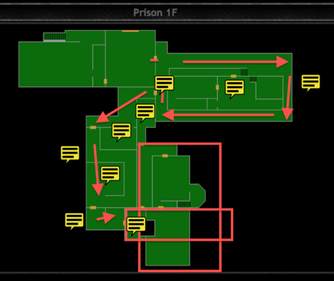
I sat down with Resident Evil: Code Veronica (the most recent Resident Evil game I had completed) and spent about three weeks full-time playing through the game, mapping out each instance of movement across the map (from each key to lock), and noting the implications for the player’s mental model. I ended up with 64 pdf files which each look something like the image above (Evil Resource is an incredible resource for Resident Evil maps by the way). The details were staggering, but fortunately everything coalesced around several distinct trends.
In brief, I found that each chapter of Code Veronica‘s gameplay had a different function within the knowledge game and built on what had come before it (tutorial, developing a mental model, testing the mental model, overhauling the mental model, etc.). The Prison area acts as a tutorial and focuses on a 4-step lock which sees the player doubleback through a handful of rooms. As Claire explores more of Rockfort Island the player is given access to large portions of the game world and the single thread of progression unravels into a system of branching paths. During this time the player can develop and refine their mental model in a freer environment. Claire’s brief excursion to Antarctica pauses the first half of the knowledge game before Chris Redfield arrives at a partly destroyed Rockfort and the player’s pre-existing knowledge of the island is used against them. The final chapter in Antarctica combines the earlier themes together, but stumbles due to the mish mash of environments which are different to mentally organise and logically fit together.
The chapter also covers progression, player choice, environmental story telling, and the components of survival gameplay.
It’s probably the most dense and challenging thing I have ever written. I found it difficult to give grounding and coherence to what is a highly detail-focused but also abstract topic. In any case, I found what I was looking for, so I can’t really complain…but I will encourage you to check out Level Design: Processes and Experiences. The line-up of contributors and range of topics covered is excellent. If this post has tempted you to read my chapter, then I would suggest playing through Code Veronica and reading as you go. The book is available on Amazon or through CRC Press in physical and digital versions.
3DS Demo Impressions Part #2
May 2nd, 2014
You can find part #1 here.
Fire Emblem Awakening
- Fire Emblem with the edges rounded off. Yusuke Kozaki’s character designs, an expressive localisation, and a streamlining of systems and interface give the game a humanity which is grounded by the core mechanical additions of strategic alignment of units and unit groupings. These two new mechanics are an elegant way of increasing the game’s strategic breadth while anchoring the characters. There’s certainly an aura to Fire Emblem Awakening.
- In saying these things, I’m highly skeptical of Fire Emblem‘s strategy gameplay. After I completed Game Design Companion, I played a number of SRPGs (Fire Emblem: Sacred Stones, Jean d’arc, and Tactics Ogre: Let us Cling Together) and took extensive notes on the genre. At some point in the future, I’d like to write up a complete investigation.
Resident Evil Revelations
- Survival horror operates on the fine balance between resources and threat. In the earlier Resident Evil games, the player had few munitions and limited control over the camera, so even a small group of zombies were dangerous. In Resident Evil 4, the player’s artillery and control over the camera increased, but so did the number of threats. Revelations is a combination of both kinds of horror. Resources are scant, the player can control the camera (although their view, of course, is still restricted—perhaps even more so by the 3DS’s lower resolution forcing a closer perspective), and, in an unexpected twist, the enemies convulse sporadically, making them difficult to hit. From sparse groups, to mobs, to one-on-one encounters.
- My initial reaction was that the combat isn’t very fair, but I probably need more time and research to think this one out. I’m putting my thoughts on hold until The Evil Within comes out.
- The lack of enemy hit-stun is concerning.
- The first person mode is interesting in that it harkens back to the earlier versions of Resident Evil 4.
Final Fantasy: Theatrhythm
- An easier version of Elite Beat Agents with the notes coming in from left to right as oppose to appearing anywhere on the screen.
- Using the bottom screen to respond to notes on the top screen lacks the directness of simply touching the notes as they appear.
HarmoKnight
- Unlike Theatrhythm, actions in HarmoKnight are more direct because you’re pressing buttons to interact within the game world, as opposed to trying to match up your stylus movements with actions occurring on another screen.
- The cutscenes in this game are so attractive to look at.
Bravely Default
- The meaty tutorial is front-loaded at the start of the demo, instead of presented in context when the player needs it. This puts a huge strain on the demo’s pacing and leaves the player with a list of things to remember that they have no conceptual understanding of. Worse still, when the player is later given the opportunity to play around with the game’s systems, the tutorial is nowhere to be found. A simple button on the touch screen would have been suffice. Because of the lack of tutorial, I found it hard to appreciate this game.
- This game is very Matsuno in style, and I’m a big fan, but it’s going to be a pass from me this time.
- The menus are a gorgeous mess. Key information should be prioritised. Everything else should be tucked away.
Project X Zone
Wow. How much time you got? This game is a complete mess . I’m not even going to bother writing about it.






 Game Design Companion: A Critical Analysis of Wario Land 4 - $7.99
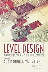 Level Design: Processes and Experiences
 Speed Boost: The Hidden Secrets Behind Arcade Racing Design - $5.99
 Adventures in Games Analysis: Volume I - $5.99


