3DS Demo Impressions Part #2
May 2nd, 2014
You can find part #1 here.
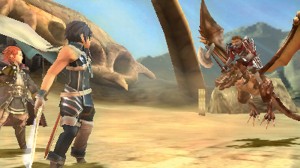
Fire Emblem Awakening
- Fire Emblem with the edges rounded off. Yusuke Kozaki’s character designs, an expressive localisation, and a streamlining of systems and interface give the game a humanity which is grounded by the core mechanical additions of strategic alignment of units and unit groupings. These two new mechanics are an elegant way of increasing the game’s strategic breadth while anchoring the characters. There’s certainly an aura to Fire Emblem Awakening.
- In saying these things, I’m highly skeptical of Fire Emblem‘s strategy gameplay. After I completed Game Design Companion, I played a number of SRPGs (Fire Emblem: Sacred Stones, Jean d’arc, and Tactics Ogre: Let us Cling Together) and took extensive notes on the genre. At some point in the future, I’d like to write up a complete investigation.
–
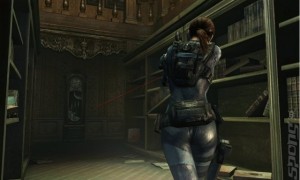
Resident Evil Revelations
- Survival horror operates on the fine balance between resources and threat. In the earlier Resident Evil games, the player had few munitions and limited control over the camera, so even a small group of zombies were dangerous. In Resident Evil 4, the player’s artillery and control over the camera increased, but so did the number of threats. Revelations is a combination of both kinds of horror. Resources are scant, the player can control the camera (although their view, of course, is still restricted—perhaps even more so by the 3DS’s lower resolution forcing a closer perspective), and, in an unexpected twist, the enemies convulse sporadically, making them difficult to hit. From sparse groups, to mobs, to one-on-one encounters.
- My initial reaction was that the combat isn’t very fair, but I probably need more time and research to think this one out. I’m putting my thoughts on hold until The Evil Within comes out.
- The lack of enemy hit-stun is concerning.
- The first person mode is interesting in that it harkens back to the earlier versions of Resident Evil 4.
–
Final Fantasy: Theatrhythm
- An easier version of Elite Beat Agents with the notes coming in from left to right as oppose to appearing anywhere on the screen.
- Using the bottom screen to respond to notes on the top screen lacks the directness of simply touching the notes as they appear.
–
HarmoKnight
- Unlike Theatrhythm, actions in HarmoKnight are more direct because you’re pressing buttons to interact within the game world, as opposed to trying to match up your stylus movements with actions occurring on another screen.
- The cutscenes in this game are so attractive to look at.
–
Bravely Default
- The meaty tutorial is front-loaded at the start of the demo, instead of presented in context when the player needs it. This puts a huge strain on the demo’s pacing and leaves the player with a list of things to remember that they have no conceptual understanding of. Worse still, when the player is later given the opportunity to play around with the game’s systems, the tutorial is nowhere to be found. A simple button on the touch screen would have been suffice. Because of the lack of tutorial, I found it hard to appreciate this game.
- This game is very Matsuno in style, and I’m a big fan, but it’s going to be a pass from me this time.
- The menus are a gorgeous mess. Key information should be prioritised. Everything else should be tucked away.
–
Project X Zone
Wow. How much time you got? This game is a complete mess . I’m not even going to bother writing about it.




 Game Design Companion: A Critical Analysis of Wario Land 4 - $7.99
 Level Design: Processes and Experiences
 Speed Boost: The Hidden Secrets Behind Arcade Racing Design - $5.99
 Adventures in Games Analysis: Volume I - $5.99


