Wasteland Ventures (Fallout) #5 – 3 Forms of Grind
January 16th, 2011
There I was really digging Fallout’s professional storytelling and engrossing atmosphere when the grinyness of the whole experience dawned on me. Now forget for a minute the collocation of “grind” to JRPGs, because Fallout is nothing of the sort. Rather than being based on mindless repetition, there are three other elements which significantly chaffed up my Fallout experience.
Interface
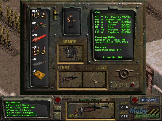
Managing large amounts of inventory in Fallout is just a complete and utter mess in micro-management due to the forced reliance on the clunky interface by the inventory-limiting strength stat. Let’s start with the equipment screen.
This screen is used for checking stats and equipment items for use. There’s an obvious issue here in that only 6 items are displayed on-screen at the one time and that access to other items requires repeated clicking on the two arrow buttons. This interface quirk is exacerbated by the fact that every new item gained or de-equipped automatically goes to the bottom of the list. The items that you use most frequently are the same items that are constantly equipped and then re-equipped (for instance, switching out guns to accommodate enemy types), so over time the least used items become the most readily available ones and accessing useful items becomes a chore and creates dead space in the gameplay.
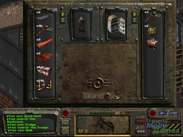
This screen is the looting and stealing screen. It is effectively the screen for “free trading”, being stealing, trading with NPC cohorts (which, by design fault, is also stealing) and taking items from interactive window dressing (cupboards, bookcases, tables, etc). The issues here are doubly worse than the prior screen because this time there are two limited displays of inventory, one for either party. Just like with de-equipped items, anything traded automatically goes to the bottom of the heap.
Let’s say that you stumble upon a rare item, but are filled to capacity. The obvious thing to do is to offload excess gear to an NPC to make room in your inventory (space, ie. weight, which is dependent on your strength stat). Keep in mind that the total weight can only be seen the inventory screen (above) and weight of individual items is shown on the same screen after right clicking and selecting observe (this changes the text in the box on the righthand side). Weight is therefore only displayed on this screen. So, you trade away. The rare item that you want is, let’s say, 3kg. You have 1kg of free room in your bag. You trade away one lot of ammo that is 1kg and another that is .75kg, leaving only 2.75kg of space. After making the initial trade with the NPC, you try to pick up the rare item again but you still can’t, your bag is supposedly full (short .25kgs). So, you go back to trade, and trade some more to the NPC, but whatever you try to trade is too large by maybe .30kg. Therefore, you trade the prior items back and start again hoping to match a winning combination. All of your trading is done rather arbitrarily, as it takes exiting a trade and looking through the inventory screen to view the actual weight, and doing this for each item consumes copious amounts of time; that is even if you can hold the items you’re wishing to weigh. Also consider that each time you trade back items, you must scroll to the bottom of the list to find it. Needless to say, trading items when you’re near full capacity is a disaster best avoided.
Maybe the biggest cock-up of them all is the bartering screen. Four sets of scrolling inventory. At least this time there is a value which indicates if the transaction is even possible.
Repair: The simplest form of repair would be to use the white space to the left and right of the interface to display more items. Specifically, the “free trading” screen could display 18 items per character if it used both the outside whitespace and the internal space, granted the avatars for the parties were placed above. And for the bartering screen, there’s an easy fix: don’t waste the above area in the middle of the screen.
Lack of Quick Exit
Watch from 6:28 to end (may wish to mute sound)
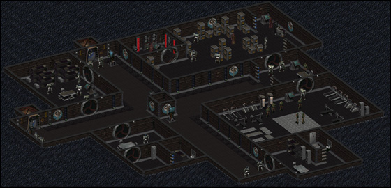
In Fallout‘s towns that are spread over several screen transitions (Junktown, The Hub, Necropolis, Brotherhood of Steel and Boneyard), it takes entirely too long to exit one of these areas. On entering each town, players can quick jump to any previously visited area divided by a screen transition via a map, however, no such option can be brought up if they wish to leave. In larger areas like The Hub, this can create 1-2 minutes of pure dead space where the player is simply waiting, unengaged, for their avatar to make it to the other end of the map.
Repair: This problem could be easily sorted with a quick exit option, speeding up the run (not sure how viable this is while still keeping the game realistic), removing large, unneeded chunks of terrain from the maps or adding exits to the main may on every section.
Exploring the Skinner Box
Fallout, as an exploration game, is faced with balancing the realism of the locations and the obligations of exploration. These two elements ought to be considered here. Firstly, each individual player has their own degree of committal to exploration in a given game. Some players choose to leave no rock unturned, other players aren’t honestly all that fussed about leaving areas unchecked. Secondly, in order for many of the environments to be contextually appropriate, they need a fair degree of furnishings. Take, for example, the Brotherhood of Steel stronghold. For this area to be a stronghold, it needs its fair share of rooms, lockers, beds, toilets and so forth. If the stronghold didn’t have enough of these things, then it could hardly be a believable stronghold, now could it? Since the furnishings can all be checked for hidden loot and may contain rare, secret goodies, obsessive explorers are unwittingly baited into mindlessly scanning every part of the environment and so ensues a grind. Now, let’s remember that this is a ramification of using interactive assets as window dressing for environments.
And thus we enter discussion on the whole skinner box debate, which is really a debate about the size and frequency of rewards in game and how it affects play behaviour. Fallout falls on the high frequency, small reward end of the scale, while, my go-to comparison game, Super Metroid, falls closer to the opposite end of the spectrum. In Fallout, players that explore often are rewarded frequently, but only in pint-sized doses. Occasionally, players will stumble on an incredible reward, in turn rationalising the need for these players to explore everywhere. This design obviously fuels an obsessive compulsive approach to play. Fortunately, there aren’t terribly many incredible bounties strewn around the place, so the skinner box effect that I just outlined isn’t all that potent, albeit still present. In Super Metroid the rewards are fewer, but more significant and require more sophisticated play behaviour to obtain (keen observation and problem solving skills).
There’s a separate argument to be had over whether interactive elements of a game which don’t yield any significant contribution to the gameplay ought to be included in the game at all. After all, if they don’t create counterpoint or interplay with the core mechanics then is there really any need for them? Yet if they weren’t there, then would there be all that much credibility to the environment? A solution depends on where you stand on this argument.
Repair: Possible ideas for repair include making all window dressing non-interactive, removing all rewards strewn throughout the window dressing in set areas to indicate that an area is free of rewards (a clear distinction between these areas must be made, otherwise players will be confused and ultimately explore less) or just reducing the size of the areas and therefore reward granting elements.
Each of these solutions has its own issues. Removing all interactivity from window dressing would make the environment feel lifeless. Having fixed areas where exploring the environment yields rewards and other times doesn’t would diminish the player’s trust in the game world and encourage them to abstain from exploring. Reducing the size of each environment would make the game, by appearances, seem less epic.
Conclusion
Fallout’s poorly designed interface for inventory management, the amount of needless walking and compulsiveness to grind for loot all dwell on the overall experience as types of grind. For now, this concludes my writing on Fallout, the Wasteland Ventures continue though as I make my way through Fallout 2. Included in my readings below is discussion on interface grind and pleasantries which may also be of interest.
Other Readings
Iwata Asks – Dragon Quest IX (Dragon Quest & Mario Similarities)




 Game Design Companion: A Critical Analysis of Wario Land 4 - $7.99
 Level Design: Processes and Experiences
 Speed Boost: The Hidden Secrets Behind Arcade Racing Design - $5.99
 Adventures in Games Analysis: Volume I - $5.99


