Metroid Prime 3: Quarterly Diaries #4
October 6th, 2009

This round we finally get off Bryyo and onto the next planet, Elysia. Having established a decent base of ideas so far, I probably won’t have as much to say about Elysia. On the other hand, I’ve been writing based on memory instead of writing while playing (which will change for the article after next), so it could go either way.
Areas Covered: Landing Site Delta, Elysia (Main Docking Bay)
Discussion Points: Dark World-esque visual design, Mogenar boss, Sky Town visual design, flying foxes
Landing Site Delta
Gnarly purples with a blue aura –welcome to Metroid Prime 2! The Dark World in MP2 was an intentionally ghastly place. The Dark World’s visual appearance was all the more frightening in its contrast against the charmingly rustic appeals of previous locales such as Agon Wastes, Temple Grounds and areas from the original Metroid Prime. Metroid Prime 2 took you out of the an archeologist’s environment and threw you into a subterranean abyss. This wild swing in visual design effectively pulled the rug out from under players and left them feeling in such a state.
The exact same dynamic works here too. This world is a repellent one and the eery setting prompts you along the linear corridors to Mogenar; the final boss of the Bryyo area.
Although the major boss battles in Metroid Prime 2 were set in the Dark World, the framework of these battles were so well made, so delectable for veteran players to grok, that it simply took the player away from the context and put them some place else. In saying that though, the visual bleakness only heightened the sense of drama and intensity which made the boss battles all the more exhilarating.
When the boss battle loses its edge though, the veneer falls apart and only worsens the situation, which pretty much sums up the confrontation with Mogenar.
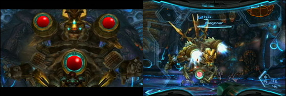
Clumsiness is again the order of the day, but I ought to first discuss the most glaringly obvious problem I have with Mogenar – those three red balls. ‘Form represents function’ is one of Nintendo’s core design principles. If an enemy has a certain weakness, such weakness should pertain the visual design. In this regard, the Mogenar creature is a little too ambitious. Hell, it doesn’t even attempt to disguise its weak points, and as a result looks unreservedly stupid.
To defeat Mogenar the player must first damage the four red balls (three on his front, one on his back) one at a time, repeat this step in hyper mode (to overload the energy of each one) and also attack his feet with morph ball bombs when necessary. This is the first time hyper mode has become a priority, almost to the point that it cripples the player in its over reliance.
After overloading one of the balls with phazon, Mogenar will launch into a dangerous offensive such as difficult to avoid electricity stomps or by rushing the player. In the latter case, the player must enter morph ball mode and then attack his crystallized feet to return him back to his normal state. For the player, it’s preferable that they overload more than one of the balls whilst in the one instance hyper mode, since entering the mode requires a submission of health tank (or half, I can’t remember!) and doing this four times over is suicide. Either of the two reactions by Mogenar severally obscures the player’s ability to attack another ball, and hence, with the time delay involved, Samus’ suit is more likely to overload with phazon, therefore requiring her to dispel it and forfeit her chance at attacking another ball. This scenario nudges the player into a difficult position and makes the confrontation a frustrating affair.
Elysia – Sky Town (Main Docking Bay)
Design-wise, it appears that each iteration in the Metroid Prime series seems to supercede the title before it by introducing a new and continually more breathtaking and iconic piece of landscape. Metroid Prime sported the peaceful ambiance of Phendrana Drifts. Metroid Prime 2 masterfully diverged from the traditional Metroid aesthetic with the technology driven Sanctuary Fortress. Metroid Prime 3 pushes the artistic beauty a further step forward with Sky Town.
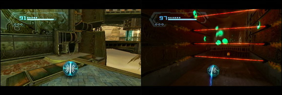
Consider Sky Town a steampunk-esque take on Sanctuary Fortress. Similarly, the two environments are a network of intricately detailed, multi-story islands connected in the sky. In contrast, Sky Town loses the cybernetic colour scheme, maintaining the rustic appeal of such areas as Chozo Ruins and Agon Wastes. It’s a design which embodies the series’ key visual strengths: the organic feel, rustic colours, minute detail and deft animation – it’s easy to feel sentimental.
Although Sky Town’s population are nothing but robot entities, the area still feels like a habitat. The worker drones are quietly working away, whilst the only enemies to interrupt your progress, the Wizard of Oz-inspired steambots, are sentries. The automation of any danger and innocuous worker drones create an environment that whilst populated is as quiet and sombre as some of the series’ best.
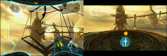
The floating islands constituting Sky Town are connected by an elaborate network of flying foxes. Samus uses the grapple beam to latch on to a fox and follows the windy trail to the other side. It’s a neat idea and is definitely enjoyable for the first few rounds but quickly becomes tiresome when you simply want to reach the other side without distraction.
Additional Readings
Metroid Prime Team Discusses Their Decade Of Samus, Ponders Series’ Future – Kotaku
Metroid Prime 3: Quarterly Diaries #3
October 4th, 2009

Areas Covered: Cliffside Airdock (Revisited), Firey Airdock (Revisited) Thorn Jungle Airdock
Discussion Points: Golumn subtext, backtracking, segregated area qualms, Korakk boss battle, Thorn Jungle, final two generators
Cliffside Airdock (Revisited)/Firey Airdock (Revisited)
After gaining the ice beam, the player must backtrack their way to the Cliffside Airdock area and mine a little deeper with the ice beam. This opens up a hidden sanctuary with the overbearing presence of a giant golem hooked up to tubes of that volatile yellow substance seen all throughout the Firey Airdock area. Another possible subtext. The lore scans throughout Bryyo tell the story of struggle between science and tradition within the culture of the extinct Primal race. The Chozo, who had first sparked the interest of science among the Primals, encouraged a balance between science and cultural tradition. Unfortunately the divisions of thought turned against each other and ultimately brought the demise of the civilisation. This story is best told through the scarring of the visual landscape. The war of ideologies has seen the falling of prominent structures in place of furnished technologies such as elevators, generators, transmission receivers and transport mechanisms. The golem is a highlight of this visual metaphor, an icon of the past bounded by the wrath of future industrialism and development.
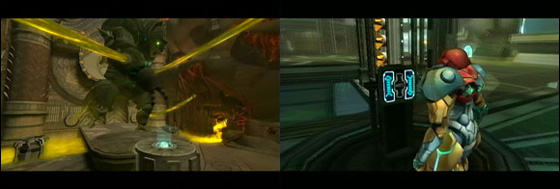
Free the golumn from his boundings and he opens an underground passage into a landing pad area for Samus’ ship. Here she can upgrade her ship to do something or other with the shields blocking access into the third area. I’m honestly not too sure. As mentioned, the objectives don’t sink well with me. Whatever happens you head back to the Firey Airdock and then eventually trek out to the Thorn Jungle area. So with all relevant upgrades finally gained, we can map the progressive structure so far like so;
Arrival at Cliffside Airdock -> Grapple Beam -> Arrival at Firey Airdock -> Ice Beam -> Return to Cliffside Airdock -> Ship upgrade -> Return to Firey Airdock -> Objective Complete
Hopefully this paints a clearer picture of the amount of required backtracking for this predominate section of the Bryyo area. Considering the next two parts on Bryyo are completely linear and (thankfully) require no planet-hopping it’s worth discussing my qualms with this dynamic now.
Maybe I’m blindingly stupid, but I frequently sent my ship to the wrong areas of the map*. You see, the planet-hopping dynamic tinkers with the play methodology in which the Metroid games have always comfortably facilitated. In prior Metroid titles, the entire world was overtly and in-overtly connected. Processing the entire world map mentally is therefore inherently challenging, hence when moving from one area to another my travel itinerary would be based on a linear path of recollected (often visual) set pieces within the environment chained together with a reliance on the room-by-room map system (ie.corridor, large room, corridor). My consciousness of the map is vague and reliant on “feeling out” the environment. Metroid Prime 3, in instances where the ship is used, forces me to assign these vague depictions to the fixed co-ordinate of a landing zone. I don’t get the opportunity to feel out the landscape and validate my hazy memory, rather I must make a preemptive decision based on invalidated recollections. I therefore feel that this system is counteracting with a piece of habitual comfort which the previous games formerly nurtured into growth.
Thorn Jungle Airdock
Shortly into the Throrn Jungle Samus duels with the Korakk Beast. So far, most of the boss battles have felt clumsy and the Korakk certainly conforms to this assumption. In fact, the process required to defeat Korakk is derivatively similar to the Rundas battle and the later battle with Ghor. You pinpoint a weakness, attack it (you need to enter morphball mode for this part), a “tug me” icon appears, you tug away with the grapple lasso, and then with weak spot revealed you whittle down the health. All of these bosses can be downed in the same formulaic fashion: weaken the outer layer, use the lasso to reveal the inner core and then attack that, with a few minor variances per battle.
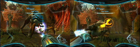
The battle itself is clumsy for three reasons: the weak spot around the mouth is tricky to judge and regularly flicks off when the Korakk prepares to tongue-grab you, the Korakk always attempts to lessen space between you and it which feels intrusive, and it’s awkward having to maneuver underneath him to bomb his under-belly region. The latter point is a result of too much overhang when the Korakk slouches in his weakened state, this knock backs the morphball and makes it awkward to slide under.
I probably should have mentioned the bizarrely amusing space pirate riding Korakk too. Very cute.
The following area of Thorn Jungle steps out of the jungle environment, and into a channel of confined areas wrought with dense technological and industrial impact. If prior areas were scarred by the mild influence of industrialisation, this part is the central core. We’ve seen this marked transition into the core; the Cliffside Airdock is the cultural hub of civilized life on Bryyo, the Firey Airdock is more industrious and features a couple of transmission centres. The Thorn Jungle is then the final visual chapter of the Primal’s story, a place where science rules. As you can see the story behind Bryyo is told on many levels: the visual story, the lore scans and the local flora and fauna. It’s the layering of each narrative piece (which to the player hardly comes across as narrative, and therefore feels very natural) that makes Retro’s artificial worlds so engrossing.
This area is headlined by a crossroads; a circular loop of connected corridors with the two remaining two generators on either side. Samus must destroy both generators, with the design allowing for a welcomed degree of non-linearity. Destroying each generator requires you to dismantle the power sources by flicking levers and attacking weak spots. You have to co-ordinate the event while fending off the defending space pirates. This scenario provides an open platform for players to flex their muscles; new players will dawdle and make mistakes, veteran players however can complete with relative ease and finesse. The pirates roll in thick and fast which makes hyper mode suddenly seem all the more useful.
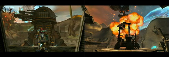
This quality, fat free chunk of gameplay with a lack of backtracking and some neat diversity, feels like a reward for the somewhat arduous sections earlier on. I was in a different mood during these sequences, which accommodates the closing of this chapter nicely. Now, to Landing Site Delta for the final boss battle on Bryyo.
*On second thoughts, I am blindlingly stupid. There were only two options, I just couldn’t figure out which area I was already on. The point still stands and becomes more significant later in the game as you’ll see.
Additional Readings
Co-Op Metroid Prime Trilogy Ep
Metroid Prime 3: Quarterly Diaries #2
October 1st, 2009

Areas Covered: Cliffside Airdock, Firey Airdock
Discussion Points: Phazon subtext, Bryyo level design, Half-life 2 comparison, backtracking, environment design, Rundas boss battle
Ok, it looks like this series of posts won’t be all that quarterly, but that’s okay. Last time I discussed Metroid Prime 3‘s opening tutorial levels on Olympus and Norion. After being flanked by Meta Ridley and Dark Samus, Samus awakens back on Olympus equipped with the new PED suit, setting out for Bryyo. This post shall concentrate on the Bryyo portion of the game.
Bryyo – Cliffside Airdock
The pragmatic purposes of hyper mode from the newly-acquired PED suit require no real explanation; it’s a new feature implanted into Samus’ suit which allows for a temporal power overload by delivering rapid boosts of Phazon. There’s a subtext here. With the substance now integrated into her suit and utilized freely, Samus and the federation (see: PED-suited soldiers), like the pirates before them, are resorting to Phazon in order to hold their ground in the continual power struggle. The trilogy has slowly edged towards a more accommodating view of Phazon. What was once feared in Metroid Prime and Metroid Prime 2 as a dangerously potent catalyst is now a natural resource; a product of necessity. The good guys have struck a deal with the devil and with Phazon comes Dark Samus; it’s by this association that you know the narrative is going to soon smack into calamity.
As a gameplay device, hyper mode only makes its presence noticed about 4/5ths of the way through Bryyo. It’s a superfluous room clearer in the meantime, which is all well and good, really, because it takes a back suit to the fact that…
…Bryyo as a whole is very well designed. To be honest, I immediately lost wind of of the objectives handed to me and just became consumed by the process of following the rhythmic flow of progression, flagging relevant points of interest for my eventual return. The series has this uncanny ability to immerse the player into its world by designing around the player’s inner psyche. You rarely have to think your way through a Metroid game, progression just comes naturally because clues are put in logical – yet never obvious – places. The scan visor, of course, aids heavily in this process but never feels like cheating, it’s just part of the exploration process. People have made the same commentaries about the recent Batman: Arkham Asylum. The cohesion of the scan visor, play-centred level design and natural-earth aesthetic elicit Metroid’s strongest emotional trigger, being the feeling of unaided realization and discovery of the environment around you. The series, right from start up throws the player into this highly rhythmic mental slumber. In regards to Bryyo, I lapsed into this state (hardcore) for the first time in Metroid Prime 3 in Bryyo, conjuring up those feelings of previous games. Retro Studios don’t let up.
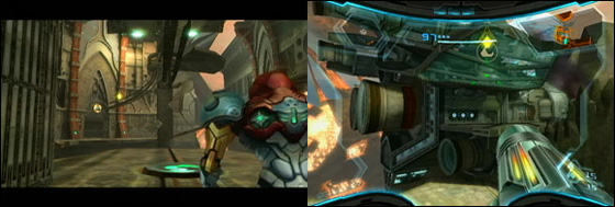
The most fascinating thing about the free form exploration is that it’s all intentional. You might feel like a genius for discovering some secret cavern at the back of the level, but the reality is, you were always meant to find it – that’s how they designed the game.
(Contrast this to the Half-life series which at times does a bloody awful job at stringing the player along. As I mentioned in my previous posts, the episodes did better, but playing Metroid Prime 3 only reasserts how poor the player guiding in the Half-life games truly were. Either game still has nothing on Super Metroid which flourishes astoundingly in this regard. On the other hand, the Metroid level design is constricted in contrast to Half-life‘s selection of open expanses. This changes the dynamic – maybe I shouldn’t make the comparison.)
The centre piece of the Cliffside Airdock area (Gateway) is a great example of this design. It’s a multidirectional entranceway, where, of course, there is only one linear path, but because the branched paths are blocked in such a seemingly natural way (ice blockages, wide abysses, falled debris; they really just disguise the fact that you don’t have X progressional power-up yet) it never feels closed off, just unattainable for the meantime.
The first weapon upgrade for this area is the grapple beam. It’s a nice choice to offer early on as the highly mobile swinging mechanic plays into the new-found fluidity in controls. After attaining it you head back to the Gateway area, follow the next stream of corridors, which you couldn’t previously access without the grapple beam, complete an objective, backtrack to the ship and then fly to the next area.
Firey Airdock
The course of the next area (Firey Airdock) adopts the same travel path; penetrate the level as far as possible, acquire new power-up (in this case the ice beam), backtrack to ship, fly to back to the other area, with aid of new power-up mine a little further, go back and do it all again. In fact, this formula is pasted throughout the entire Bryyo area, occasionally interluded by convenient landing zones for your ship. Ultimately then the same amount of backtracking as prior games ensues, albeit in smaller doses. Doesn’t this demean the convenience of the segregated areas preventing excessive amounts of backtracking? The ship does alleviate a good deal of backtracking, true, yet Retro, at least in Bryyo, don’t treat each section as a single chunk of gameplay, rather they’re a series of islands which must be mined back and forth. It’ll be interesting to observe if the other planets are designed in this manner too.
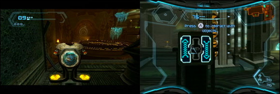
In contrast to the (Cliffside Airdock area’s) similarities with the Aether overworld from Metroid Prime 2, the visual theme of the Firey Airdock area is akin to Magmoor Caverns from Metroid Prime. Pleasantly though, either locale never feels borrowed, derived or too familiar. The Cliffside Airdock area music doesn’t have the thunderous presence of its forebearer, rather it’s a historically lived-in site with signs of cultural prestige and social functionality. The Firey Airdock area is more industrious than Magmoor Mines with elaborate mechanical puzzles operated by a volatile, yellow jelly.
By this stage Retro have well warmed the seat for the player. The puzzles and level design are instinctive and easily on par with the rest of the series, only aided by the fluidity of the controls. The controls, mixed with the streamlining (such as flicking through visors and only having one beam) remove the baggage of the previous games and allow the player to freely dive into business. Further examples of the clever interfacing are seen in the landing site puzzles up ahead.
I ought to talk about the Rundas boss battle first though. I found this confrontation to be rather awkward. Three things contribute to this; firstly, the playing space is cluttered by an excesses of frozen spires. They’re simply difficult to weave around when your target – and hence viewpoint – is directed towards the sky and not the ground. Secondly, Rundas moves too fast when in flight mode and often spins in circles. It occasionally seems as though the path finding is muddled. Lastly, the design of the environment is over contrasted by the imposing yellow sky which you are forced to point towards.
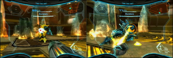
On the other hand, the battle utilized the tugging of the grapple well and moved between a series of play states; in the air, on the ground, attacking and defending which kept momentum continuous and the battle engaging.
Additional Readings
Metroid Prime Trilogy Review – Eurogamer


 Game Design Companion: A Critical Analysis of Wario Land 4 - $7.99
 Level Design: Processes and Experiences
 Speed Boost: The Hidden Secrets Behind Arcade Racing Design - $5.99
 Adventures in Games Analysis: Volume I - $5.99


