Play Impressions (And the Rest #1)
April 18th, 2009

2009 is my final year of playing the role of student chump, before too long, life will force me to man up and join the world’s diminishing work force. For these reasons I want 2009 to best be remembered as the last year of my youth and to fulfill this aspiration I plan on consuming and creating a hell of a lot of media before my leisure time is sacrificed to the man.
The following selection is of surplus titles I’ve completed in the past 2 months which actually haven’t seen coverage on my blog. Looking at the number of games and discussion topics I have for each, I’ll likely have to chunk this out over several posts.
Flower
No, it didn’t make me cry, but it sure was a lovely featurette of a game. Much like thatgamecompany’s previous effort fl0w, Flower is a game with elegant mechanics, whimsical aesthetics and an engrossing musical score. The two games share a common ground in that they’re primarily centred around the concept of kinetics and movement. In fl0w you controlled a small, organic life form in a sea of solid colour, in Flower, the pond is replaced with open fields of grass and flowers yearning for life. You’re a pettle caught in a gust of wind which you steer with the six-axis motion control and accelerate by holding any of the buttons. Touching lifeless flowers bred-crumbed throughout the environment springs them to life, where pollinating a complete field is usually the goal of the game.
The motion controls work beautifully, previously when I’d used the six-axis in other games, I always felt that the controller couldn’t pick up anything beyond shaking, but Flower executes without a hitch, giving me unexpected faith in the motion control.
Like fl0w, Flower has no tutorial except an icon indicating that you ought to try rotating the controller. The premise is just that simple, you’ll probably never notice the exclusion of tutorial, or text for that matter. Besides the title and credits, Flower has no text to it, yet communicates a quaint, eco-friendly narrative through the use of in-game presentation and some light landscape scenes sliced before each level. The powerful message narrated by minimalist presentation and mechanics is the single greatest merit to the game.
(And here’s the part that everyone missed when they were busy writing their personal anecdotes and love letters)
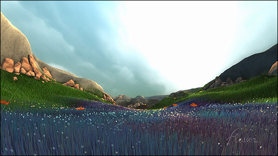
By controlling nature itself (the wind, not the pettle) you’re breathing life into a dry environment, which I found very empowering. As though my play is doing a good deed for mother nature, this obviously makes me feel special. Flower achieves this through clever use of visual and aural design. An environment begins in a lifeless state, weak hues, dry colours and an empty wind all express this. Your pettle then becomes something of a paint brush as you begin to colour in the environment. Others have said that Flower has apt level design, I disagree, rather I think the use of contrast used to lead your eye is what makes the navigation so breezy. The colour is aided by the geography of the landscape which is also used as visual hints to point you in the right direction. If you’re ever stuck, follow the natural topography of the landscape. In order to navigate the rolling fields, curling crescents, the player needs to trust the visual aura of the landscape (and to a lesser extend the aural and design) . It’s this constant reliance on landscape (the game’s sole protagonist) that allows Flower to suck you into the narrative and atmosphere. You feel at one with nature and hence when the later stages show the protagonist on the cusp of death (again, highlighted through design; unsaturated colours, soleless music, dangerous hazards), the emotional strings are pulled (if they weren’t already tugged by the general whimsy, feel good nature of being a servant to mother nature). When you push through those darker stages, the game reveals itself again with an exhalation of hope and the music steps up like the song of tweeting birds. The light piano keys and momentum of the soundscapes also play an enforcing role in Flower‘s suction. The aural mood winds up and works down in tandem to the momentum of the play. This is most apparent in the final level. The effect the mechanics bear on all this is self explanatory; using the motion control is suitable and liberating, aiding the vibe of the game. It’s the presentation that is the draw card though.
The game has a few slight design issues, where it can occasionally be difficult to tell where the next marker is as it’s either absent or too far away to be visually distinct. Some of those darker levels tend to be weaker, again mainly due to the less distinct visual cues. The credits also go on for far too long I think, minor quibble perhaps.
Not a negative criticism, but this is the type of game that feel like completing only once. Due to the length of the game, finishing it was similar to watching a movie; there’s no need to revisit the material so quickly. Lastly, I find it interesting how Flower was influenced by Jenova Chen’s experience of moving from Shanghai; a concrete jungle.
You can download Flower from the Playstation Store.
That gamecompany Flower website (videos, additional screenshots and information).
Kirby 64: The Crystal Shards
Kirby 64 is a simple game as well, but unfortunately its simplicity is to the game’s detriment. A 2.5D platformer, Kirby‘s worst asset is the blindingly slow pace. Kirby’s default walk is painfully slow and his (ultra cute) run isn’t much faster. This is exacerbated by a camera that always seems to be creeping ahead of you. As you’re making your way through a stage with all the haste you can muster, the camera will begin to curve, hindering your foresight and giving lead way to what’s behind you There’s almost no reason for the camera to over work, as there’s never anything worth thinking about behind you. It’s more of a minor pest though, ironically, since it’s difficult to mess up with Kirby’s slow walk no matter what is shown in front of you.
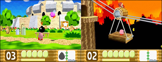
Otherwise you can combine your absorbed abilities with others to create mixed abilities. It’s a worthwhile inclusion, but you never seem to have the right ability at the right time. In fact some of the crystal shards require you first to take an ability from another stage and then enter X stage to combine that ability with another, allowing you to reach the shard. Such long-winded requests of the player are simply uncalled for.
Kirby 64 is broken up into six planets each containing several levels with 3 shards (beginning, middle and end) hidden away in each. You can complete the game without collecting all of the shards if you wish.
The presentation of Kirby 64 is no frills, not particularly interesting despite the Kirby staples. The ultra cute characters and cutscenes are the biggest grab by far. Wow, this series just nails cuteness and Kirby 64 doesn’t let up in that department. Overall though, I find this one a little difficult to recommend.
You can download Kirby 64: The Crystal Shards on the Wii Virtual Console
Kirby 64: The Crystal Shards on MobyGames
Kirby 64: Silent Cutscenes
March 29th, 2009
I’ll probably follow this up with some generally impressions later on, but I wanted to spend this initial post discussing my favourite aspect of Kirby 64. If you have 11 minutes to spare (or even just a couple), and don’t mind having the game spoiled for yourself then take a look at the cutscene compilation below.
http://www.youtube.com/watch?v=U40hVo77qgwThe cutscenes in Kirby 64 are interesting and not just on the cute factor alone. I have to fess up and say that the animation and facial expressions of these miniature stories drew me into the idea of posting solely about them in the first place. Kirby’s draw dropped curiosity and King Dedede’s sullen pessimism are all so charmingly rendered with the simplest of shapes and textures. They colour the vanilla gameplay sequences with up-beat, positive energy – oodles of happiness. It’s not my key point, but damn, this game is adorable.
The voiceless cast rely on miming actions, and exaggerating facial expressions and body movements to convey their feelings of a given situation. In a way they’re similar to the 8 and 16-bit characters before them, which had no choice but to frantically mime their actions as a way of squeezing personality out of a handful of pixels. There is a distinct difference between the two though. Kirby and pals jesture because they lack a voice, a language (beyond odd ‘yelps’), the 8/16-bit characters did this because they lacked the respective technology and instead leaning on text. If they had a choice, they’d probably be speaking. Kirby and friends don’t even have text, nor the will or ability to speak.
Kirby is and always has been a children’s game. It’s a game many gamers, including myself thoroughly enjoy, but generally speaking the series is usually light on challenge and saturated in a care free vibe. It’s perhaps aimed at an audience even younger than the general perception of the children’s audience, since not even language is a barrier to entry. Many childrens games and media feature talk and dialogue, Kirby doesn’t. It’s similar to the Teletubbies in a way, except void of any fictional exclamation language. The freedom here for younger children, or at least children still processing language to understand is very accessible.
Kirby 64 like some other media normalizes dumbness – that is lacking the ability of speech. It’s a game that hadn’t vocalized it’s cast in an era where voice boxes were being added to old friends. While I’m no particular expert on the subject, I think there is obvious merit in a game that avoids speech altogether, instead focusing on other means to communicate. I wonder how such games and media like this are interpreted from people with a background of not being able to speak. I guess it would be something of a mild encouragement to see this transition in a medium like video games. Kirby 64 portrays the lack of speech (like everything in the game) in a pleasant nature. It doesn’t focus on the frustrations of miscommunication, rather every exchange is a success. I wonder what effect this has on such an audience, if any.
I discussed this briefly with Richard Terrell from the Critical Gaming blog as well, and he further likened it to the idea of silent films which is another suitable example.


 Game Design Companion: A Critical Analysis of Wario Land 4 - $7.99
 Level Design: Processes and Experiences
 Speed Boost: The Hidden Secrets Behind Arcade Racing Design - $5.99
 Adventures in Games Analysis: Volume I - $5.99


