Tutorials: Do You Understand? (Y/N)
July 13th, 2010
[I will start to post my material from Kombo here on DanielPrimed as well. Please enjoy it as it’s basically business as usual, but just a tad slower.]
Several months ago, I took an intensive course in ESL teaching (English as a Second Language). Before we began our immediate practice lessons – by which the school roped in non-native speakers off the streets with the ploy of free English lessons – our teachers provided us with a list of common Do’s and Don’ts for teaching English as a second language. The most contentious dot point, of which there were many, was to never ask students “Do you understand?” as students would inevitably answer “Yes,” even if they weren’t entirely sure. The solution isn’t to ask whether they understand, but to instead test them so that you, as a teacher, know precisely whether they understand and if not why not.

Video games are systems which contain rules and facilitate mastery; as much as mainstream media would assure you otherwise, games are inherently education-orientated. Think about it: every game you play begins with a tutorial and concludes with a test, the latter often masked as a final boss. The design of video games and the principles of education are therefore very closely interlinked.
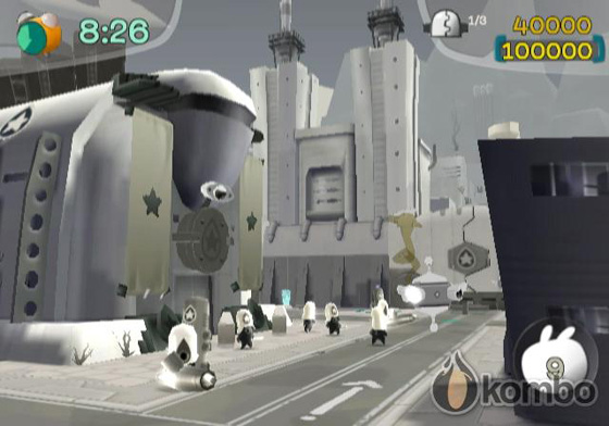
Good video games are good teachers and good teachers ought to obey sound teaching principles. Now to return to the question of “Do you understand?” Just recently, I was reminded of this question when playing deBlob (Wii).
Right at the beginning of the game and every time thereafter when Blob encounters a new form of enemy or is introduced to a new mechanic, a short multi-paged tutorial covers the screen, complete with diagrams and forward prompts, concluding with the question “Do you understand?” and the options “Yes” and “No.” The problem is obvious, right? Forgoing the interactive qualities of the medium, deBlob falls back on passive text and images as its means of communicating rules. It’s a confounding move, particularly as deBlob otherwise follows a “form meets function” approach to design where you almost immediately understand how to defeat INKT Corporation’s black and white goons based purely on their visual character. Furthermore, deBlob only has two primary mechanics (roll and pounce), so it would be difficult for players, even inexperienced players, to misinterpret the game world. The information is completely needless in the face of the already clear design.
DeBlob ought to have instead constructed scenarios which guide the player into solving the problem for themselves, allowing them to deduce solutions from the clear “form meets function” design. When players realize rules and mechanics for themselves, they feel independence and ownership over what they’ve learned; the game makes them feel smart. deBlob‘s tutorials state the obvious, nothing that can’t be understood in under 30 seconds of play. The text tutorial thereby feels obvious and patronizing.
An ideal example of how rules can be communicated clearly through design is in Super Mario Bros. In the first 10 seconds of play, the player knows that you’ve got to jump over or on top of enemies and that the mushrooms hidden inside the question blocks increase your size and life. You can’t make any progress if you don’t jump over the first Goomba and the player will always receive a mushroom since it travels to the right hand side, bounces off the pipe and corners you making it impossible to avoid. In just 10 seconds, the main rules are explained without any need for words.
The best games are those which teach through practice and participation, that embedded the instruction manual into the experience, rather than paste it wholesale in front of you. Don’t get me wrong, text as a visual medium along with sound are very important in tutorial, however, they should work in conjunction with the experience and not in replacement of it. That way, players don’t need to be asked whether they understand.


 Game Design Companion: A Critical Analysis of Wario Land 4 - $7.99
 Level Design: Processes and Experiences
 Speed Boost: The Hidden Secrets Behind Arcade Racing Design - $5.99
 Adventures in Games Analysis: Volume I - $5.99


