Prince of Persia Classic Criticism
May 23rd, 2009

[After returning to this title for a further play through, the combat suddenly made itself perfectly clear, meaning that some of the arguments below aren’t so much applicable, but definitely representative of what the game was like at the time. I’m not sure why the suddenly clicked for me, but considering that I had to play through the complete game to reach that point where the combat mechanics made itself evident, the criticisms seem valid. Frame this article to the time of the first playthrough. I may write a follow up soon. Thanks!]
I never made it very far through the original Prince. The acrobatics were delectable, but oh how I loathe the swordplay. The graceful display of kinetics is paused so that a two person fumbling act can take place. It’s not a matter of the swordplay breaking the pace, but rather a clumsy mechanic impinging upon a polished one.
It’s almost ironic too that the publisher who bought into this brand name, had similar issues with their own title; Assassin’s Creed, almost 20 years later. Where the climbing outmatched the dueling to imbalanced proportions. I haven’t played to length Assassin’s Creed, nor have I of last-gen’s Prince of Persia Trilogy (it’s on the shelf though, gotta love those 3-packs!), so Prince of Persia Classic comes with no strings attached. I can just jump back into the title, and see if my older self can overcome the flimsy combat.
As you’re no doubt aware, Prince of Persia Classic is the titular, modern take on the original game, furnished with the décor of Sands of Time. Classic was pioneering in a way; being one of the first titles on the downloadable services to cover a remade, repackaged retro classic. Let’s not take for granted now.
Prince might have all the modern trimmings, but the issues of the past are quickly resurrected. Esteemed mobile phone developer Gameloft have done a great, if not occasionally sloppy job at this adaption, mending the melee combat as well, yet the same old problems still show through. Whether these issues can be attributed to the past design or the changes to the new model, I’m unsure (it’s been a long time), whatever the case it’s still problematic.
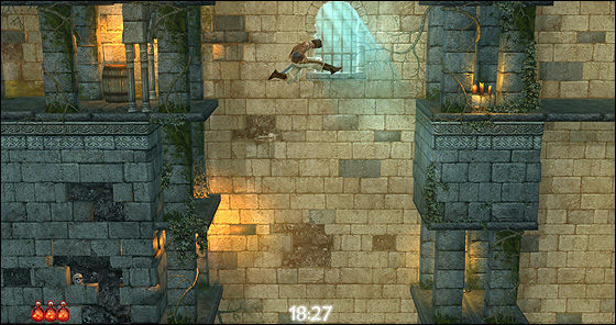
The core problem with combat – and let’s get this right out the way – is the lack of clarity presented to the player. This operates in two ways, firstly it’s not always clear when the enemy will/can attack you making it very easy to misjudge, go for the swipe and lose out. The new-fangled slow motion has no effect at aiding in the timing of blows whatsoever, it paces the back and forth jabs nicely, making it a good moderator of battles while looking aesthetically swish. In terms of the suggested function (allowing one to determine the preceding action of a combatant), what the slow motion suggests and actually services are at ends, causing confusion by contradicting the perception put forth. The second issue is again related to the interplay of the characters. When one attacks, the other can receive the blow, dodge it or shield it with their sword. Once I became as accustomed as I could to the relative combat system, I found that the jousting felt out of my control, perhaps even automated. That is, when I attack and they shield, then we enter a rather shifty, on-edge combo, which may extend 3-5 turns by either player. When implanted in these combos, I reacted almost quicker than I had imagined myself doing so. There was no mental assuredness to affirm the move I’d just input. I’m not particularly sure if maybe it’s my zen like sword skills (I was a sword master in another life you know) or the game itself – the inner-workings of the combat system are rather vague.
The original title was glamoured for its smooth animation, and this – unsurprisingly – stands true today as a glowing testament. Wisely taken, the animation remains unaffected by the change, but much as it did in the day, there are still some oddities about it. Prince of Persia had a very unnatural aesthetic. Many games before the 3D-era, particularly on the PC front, were pushing for heightened realism and as a result created strange amalgamations that represented some form of attempted realism tainted by hardware limitations. Prince of Persia was the polar opposite, it flowed so smoothly that it was unreal to watch.
There is a slight jerkiness in animation though, as caused by the piecing together of overtly smooth animations to the stationary frame. Every time the animation loops back to the default we witness the crink in the bones, and it happens frequently.
Prince of Persia Classic is a mostly well done, sometimes awfully sloppy remake. The new coat of paint looks spiffy and fits appropriately with the flesh of the original game. Sound design is also well done, but like the original you probably won’t notice it much*. The ear murdering menu sound effect must be mentioned and then destroyed as it’s blatantly offensive and overused beyond irritation. As for the rest, the screenshots more or less give you the general picture, I’m not here to describe graphics.
The sloppiness is unfortunately rather apparent. Close up the texturing leaves a little to be desired. This is noticeable during the cutscenes lifted straight from the original. Unfortunately the cutscenes feel awkward as they’re spliced between two loading sequences which just elongate them, and come off stilted rather than effective. Ah, the curses of modern technology. The text in menus and story sequences look atrocious. For some reason, the transparency is lowered and it becomes difficult to read as by conscious design decision. The animation too can be a little rough. When a character dies on the edge of a platform, they jolt before transiting down the crevice. It looks ugly. The whole production is remade faithfully to the series, but be cautious of the rough patches which can become a slight detriment to the overarching quality.
Excluding the cosmetics, it’s still hard to see why they didn’t properly address the combat. Gameloft approached it, fiddled around, and the end result is better but still highly flawed. Like all of the criticisms listed, it’s significant, but doesn’t damage this title as an essential purchase, and the definitive iteration.
So I’ve barked on for some one thousand words now, yet I still love this title. There’s an innate magic to Prince of Persia. It’s the Arabian Nights for this generation. As one of my tutors would call it “an intervention” of this tale passed down for centuries. Prince of Persia is the ideal electronic embodiment which I think explains a large part of it’s appeal; it’s divinely pure in its subject matter. I hold a lot of sentiments towards this game, which I hope carry onto the other titles when I do get around to eventually playing them in full.
Additional Readings
Prince of Persia Classic/Original Video Comparison
Mobile Phone Iteration
Prince of Persia Classic Shows How 2D Remakes Should Be Done
*Did the original PoP even have a background track?
[Pro-trip: You can walk through the spikes, just do it slowly]
Tuition of Curves: WipEout HD
May 18th, 2009

Mastery of WipEout demands the player become acquainted with the game’s beautiful formation of archs, curls and bends. Track design that accentuates curvature, curvature that’s as pleasant as the well rounded assets of a shapely women; WipEout‘s design converges at elegance.
Track design is the strongest embodiment of WipEout‘s womanly feel. It narrows and widens with the inhaling and exhaling of the game’s cleanly chaotic atmosphere. Security railings are removed, opening up space before large descents into hard crooks that loosen after the transition. Bends tighten following moments where there is visible air between the pod-like crafts, breathing in and hardening the friction between vehicles. The in and outwardly shifting design is a catalyst for the vicious confrontations that only escalate on higher speed classes. Tracks are a construction of sequentially well timed hoop jumping obstacles that train you to breathe in time with the momentum of each track, handling each curve with precision. WipEout heightens the affinity between player and race by employing an firm gravity between craft and track that bobbles with the waves of ascents and descents in the track. When I shared lunch with Daniel Purvis from Graffiti Gamer he described this game as though being strapped to the front of a rocket. It’s the gravity to the track then that makes you feel pinned down to earth, held close to the track and its design. Your craft is raised but at the same time bolted down, hovering just above the ground, ensuring that turning never feels slippery as you direct the craft like a canoe, using the back to steer the nose of the vehicle. The bind, holds you tightly to the track and never allows you to skip any part of the training course of opportunities to tackle a rounded corner. It’s as though the whole game is centred around tackling these womanly curves. The difficulty too enforces this by demanding a mastery set by the game’s tough series of grids. And with each of the four speed classes, the way you manage each curve changes based on the point on the difficulty continuum. This itself is the whole game; maneuvering curves in a series of training drills and then doing it again with modest reassessment on higher speeds.
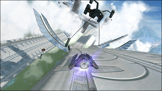
Graphic design is similarly slick. Special note must go out to the cute, shifty animations for each of the fictional in-game brands. The visual design of the brand iconography has clear inspirations from Asia with splashes of Japanese and companies for products of particular urban Asian reference including robots, noodle bars and energy drinks. The menu design is similarly serene and tidy. In game the same holds true; tidy, clean, futuristic. The colour selection and hues play again into the consistently feminine feel of the game, with light blues, greys and pinks overlayed with a slight grey tinge to create a plushy, “club” vibe. This is particularly true in the later tracks Ubermall and Sol2. WipEout loses the realistic shell in Zone mode, where the game pulsates with fruity colour and rich hues. It presents some of the most visually striking imagery I’ve ever seen, and springs to life with visualization of the background music.
The 9 track selection of favourite clubbing tunes should be familiar, even to those not immersed in the music and culture. I certainly recognised a good deal of them, surprisingly. It might have been Cam Shea who said that the WipEout series is essentially ‘Clubbing: The Game’ and like Purvis’ statement I think it’s quite true. The music is lifted straight from the scene, but so too is the atmosphere as I’ve outlined. The whole feminine side of WipEout shares much similarity with clubbing culture and can easily be pointed to as part of the source material of this series.
The game design accentuates womanly curves, the visuals textualize this metaphor with light colours, elegant architectural design, soft glows and an airy atmosphere, and lastly the sounds are a palette of the best from a woman populated culture. These design decisions not only create a womanly aesthetic, but also a womanly feel. The package is balanced in a way that feels poignantly feminine yet isn’t explicitly over gendered.
Play Impressions (And the Rest #4)
May 14th, 2009

I don’t have terribly much to conclude on these last two titles, but they’re commentaries that I feel need to be said;
WonderBoy in Monster World
Any game with chunky sprites and googly eyes is a winner in my book, now add some rose tinted nostalgia and you’ve made yourself fine cocktail of retro loveliness. Beyond the sappy cuteness, WonderBoy walks a fine line, mastery of allurement. The slow walking speed, mostly barren landscape, and vanilla combat makes for a rather weary Metroidvania (lite) adventure – it’s almost monotonous – but it’s not and that’s the magic. The trick is a little spice through means of environment. The preset template for WonderBoy is adequate; it’s a 2D, open world platformer with combat elements and an overlayed equipment system. The environments act as both visual distraction as well as steering the game’s momentum. Each environment has some form of gimmick, whether it be swimming underwater, shrinking into a pint-size version of yourself or the series of side-kicks that the small townships hand to you. Each mechanic introduced per stage keeps you on the chain a little longer. The puzzles can be random, and at times too few cues are given to the player, resulting in blind guess work for progression. The platforming and combat is definitely on the lite side, and lacks a succulence to it, but that is after all the game’s motif; from the big sprites, to the simple design, the game is rather primary – it’s Wonderboy. I see this now as an ideal introduction for younger children into more esteemed platformer titles.
PixelJunk Eden
..the commenters were right. I’m still crawling my way through PixelJunk Eden and it’s become painfully obvious on the upwards climb through the later levels just how deceitful this game becomes. Eden for me, is now a continuum of awkwardly-placed, just-out-of-reach fodder designed to tease your patience. Particularly in the stage with the changing gravity (Garden 6?), Eden throws you around the place with no regard to any progress made. The earlier stages do this through height, this stage does it through random gravity switches. Instead of falling to your doom, you veer out of place…to your doom. All progress towards that elusive spectra is lost, and the tag-teaming grimp pair need to begin another journey to some upwards, downwards, eastwards or westwards direction, following the next pulsating, coloured light. There is little discretion for the player, it’s simply maddening the lack of consideration doled out. Jumps from one land form to another, on first glance appear possible, but (with the inclusion of swaying) becomes a dastardly difficult task. It’s a devious dance of clipping and swinging off masses to other, far away masses, failing, being heavily penalized and then forced to repeat. Playing in co-op makes the circus difficult to decipher still, I can never figure out which player the camera is panning too, and which one of us it will follow when the other falls out of frame. Argh, show some restraint please! There’s no way I’m buying encore.


 Game Design Companion: A Critical Analysis of Wario Land 4 - $7.99
 Level Design: Processes and Experiences
 Speed Boost: The Hidden Secrets Behind Arcade Racing Design - $5.99
 Adventures in Games Analysis: Volume I - $5.99


