Tuition of Curves: WipEout HD
May 18th, 2009

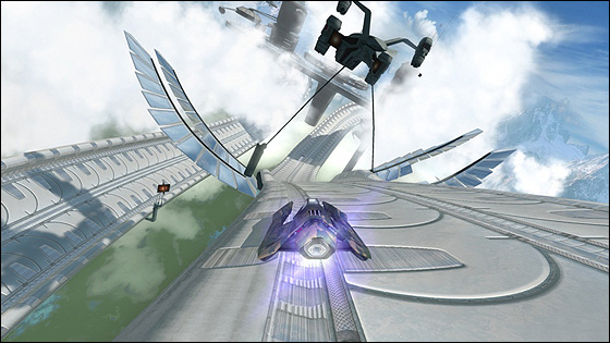
Mastery of WipEout demands the player become acquainted with the game’s beautiful formation of archs, curls and bends. Track design that accentuates curvature, curvature that’s as pleasant as the well rounded assets of a shapely women; WipEout‘s design converges at elegance.
Track design is the strongest embodiment of WipEout‘s womanly feel. It narrows and widens with the inhaling and exhaling of the game’s cleanly chaotic atmosphere. Security railings are removed, opening up space before large descents into hard crooks that loosen after the transition. Bends tighten following moments where there is visible air between the pod-like crafts, breathing in and hardening the friction between vehicles. The in and outwardly shifting design is a catalyst for the vicious confrontations that only escalate on higher speed classes. Tracks are a construction of sequentially well timed hoop jumping obstacles that train you to breathe in time with the momentum of each track, handling each curve with precision. WipEout heightens the affinity between player and race by employing an firm gravity between craft and track that bobbles with the waves of ascents and descents in the track. When I shared lunch with Daniel Purvis from Graffiti Gamer he described this game as though being strapped to the front of a rocket. It’s the gravity to the track then that makes you feel pinned down to earth, held close to the track and its design. Your craft is raised but at the same time bolted down, hovering just above the ground, ensuring that turning never feels slippery as you direct the craft like a canoe, using the back to steer the nose of the vehicle. The bind, holds you tightly to the track and never allows you to skip any part of the training course of opportunities to tackle a rounded corner. It’s as though the whole game is centred around tackling these womanly curves. The difficulty too enforces this by demanding a mastery set by the game’s tough series of grids. And with each of the four speed classes, the way you manage each curve changes based on the point on the difficulty continuum. This itself is the whole game; maneuvering curves in a series of training drills and then doing it again with modest reassessment on higher speeds.

Graphic design is similarly slick. Special note must go out to the cute, shifty animations for each of the fictional in-game brands. The visual design of the brand iconography has clear inspirations from Asia with splashes of Japanese and companies for products of particular urban Asian reference including robots, noodle bars and energy drinks. The menu design is similarly serene and tidy. In game the same holds true; tidy, clean, futuristic. The colour selection and hues play again into the consistently feminine feel of the game, with light blues, greys and pinks overlayed with a slight grey tinge to create a plushy, “club” vibe. This is particularly true in the later tracks Ubermall and Sol2. WipEout loses the realistic shell in Zone mode, where the game pulsates with fruity colour and rich hues. It presents some of the most visually striking imagery I’ve ever seen, and springs to life with visualization of the background music.
The 9 track selection of favourite clubbing tunes should be familiar, even to those not immersed in the music and culture. I certainly recognised a good deal of them, surprisingly. It might have been Cam Shea who said that the WipEout series is essentially ‘Clubbing: The Game’ and like Purvis’ statement I think it’s quite true. The music is lifted straight from the scene, but so too is the atmosphere as I’ve outlined. The whole feminine side of WipEout shares much similarity with clubbing culture and can easily be pointed to as part of the source material of this series.
The game design accentuates womanly curves, the visuals textualize this metaphor with light colours, elegant architectural design, soft glows and an airy atmosphere, and lastly the sounds are a palette of the best from a woman populated culture. These design decisions not only create a womanly aesthetic, but also a womanly feel. The package is balanced in a way that feels poignantly feminine yet isn’t explicitly over gendered.


 Game Design Companion: A Critical Analysis of Wario Land 4 - $7.99
 Level Design: Processes and Experiences
 Speed Boost: The Hidden Secrets Behind Arcade Racing Design - $5.99
 Adventures in Games Analysis: Volume I - $5.99


