Quake and the Feeling of Nightmare
December 19th, 2008

You may remember that I stashed a pile of classic PC games on my ailing laptop before making the trip over to Shanghai. It’s kind of strange then that I haven’t actually talked about any of those games up to now – with the obvious admission of a few, select indie titles. Finally I finished one of those classic PC games, being the original Quake, and here is my experience of life in hell.
Well actually, unlike its forefather; Doom, Quake isn’t really set in hell, it’s more of a sometimes-rustic-medieval-grudge/sometimes-rustic-futuristic-grunge like set up, with enemy types suitable for either décor. Despite not being set in Satan’s domain, Quake most certainly does a good job at making you feel in a sort of nightmare state;
Paralysis
Much like the build-and-expand-upon nature of id software’s first person shooter development, Quake plays much like a semi-evolution of Doom, in the same way that Doom expanded upon Wolfenstien 3D before it.
Quake’s most significant advancement over Doom is that it’s set in an actual three dimensional playing space and not in sprite scaling, pseudo 3D world. While the game is 3D in presentation, the ability to look on the vertical axis (up and down) with the mouse is absent from the game entirely, falsifying a true sense of 3D perspective. So basically, you have the enclosed feeling of Doom, in an open, 3D space. Unlike its sequel Quake II, vertically looking up and down is awkwardly mapped to the key pad, rather than being handled by the mouse (gliding forward and back). Having to look up or down then requires you to forfeit your hand at the mouse, forcing you to use one axis at a time. Furthermore, with auto-assist aiming used for targeting enemies on higher or lower planes, the need to look above or below is completely mute.
The lack of seemliness vertical sight places an unbalanced emphasis on the horizontal axis, as well as destroying the illusion that Quake is a 3D shooting game through both graphics and play mechanics. The latter breaks the visual intuition created by the 3D game world and makes Quake feel two steps digital, one step analog; a semi-evolution of Doom, instead of a “true” 3D offering. It works against the player’s expectations; intrusive and awkward, almost spiting the player for it.
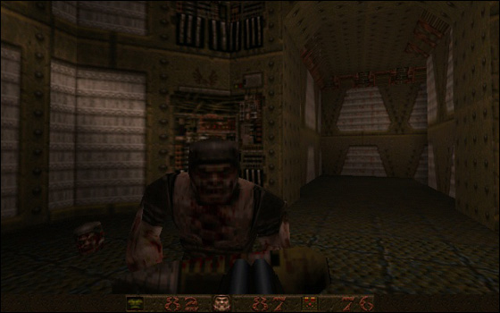
The former (horizontal emphasis) elongates part of the movement set and ultimately becomes the crutch as to how you play the game; consistently crunching on the one axis. Yet the reliance on this axis is unnatural. People do not turn their heads on one plane, they freely move their head around with digression and so forth. The fast paced run also feels unnaturally skippy. Again, creating a separation between the game world and player, likening itself to something more foreign.
Disfiguration
There are many different types of graphical issues with early 3D games that most modern-day players would find undeniably cringe-worthy, Quake happens boasts a lot of them. Considering the flat design and hollow feeling of Quake’s interiors as well as a lack of animation from set pieces, the enemy types are easily the most prominent graphical component in the game. Furthermore, without the ghoulish creatures on screen, there is no conflict, no real interplay for the game to substantiate itself.
Knights awkwardly limp to reach you, putting one foot out of place as they walk. When they jump, they maintain still, ‘frozen’ poses as they follow linear motion guides. Flying “silk worms” float jadedly through the air without wind or physics, occasionally making mechanic jolts to the left or right. Their body structures are broken by the jaggedness of polygons. Kneecaps are pointy, faces are square with smears of textured pixelation. And up close, it all becomes more of a mess.
As the above description details, the technical limitations in texturing, modeling and animation all result in this crippled take on convincing. These creatures look and behave in obtuse and robotic ways which lessen the feeling of familiarity and heightens the sense of abstraction. A divergence away from realism and into the macabre only acts a driver for the sensation of fear.
Aural Emptiness
Quake lives in the silence. Occasionally a light touch of ambiance creeps in (ie. you will notice the grungy soundtrack) but more often than not the game pleasures in its own soft quietness. The sound effects in this case have a larger presence, playing the role of warning beacons. It’s a trick lifted straight from Doom, but doesn’t sacrifice any of its magic.
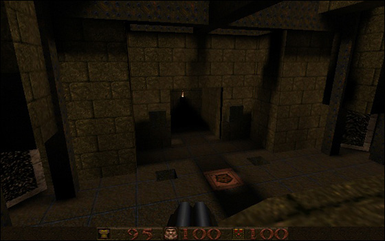
You walk into an area populated by demonic wrath and you hear them, you know that they are awaiting your entry. The game is teaching you to maintain caution. On the other hand, once you’ve shot through all the populates of a given area, the game returns to Trent Reznor’s tinny take on ambiance, alerting you that the area is safe from harm, for now. The game is building hunter instinct within the player, hence keeping an ear out is important to survival.
These sound effects are crippled by compression, they are about as ugly as the disfigurations that vocalize them.
Maze
It’s probably a fair judgment to say that a lot of the creative ideas for Quake’s level design were directly inspired from the same people who design those devious hedge mazes. Don’t you think?
While the levels are all well designed –as discussed previously– they are patterned, formulaic and ultimately become tricky enough to test your mental wits. They are brain teasers, made worse by the limited palette of dark browns used to paint the walls. The design, particularly in some of the more enclosed levels makes you feel like a rat in a maze trying to escape from this maddening place. This very design, works in tandem with the ‘wasted’ feeling of the visuals to create a strong sense of being stuck in a labyrinth/dungeon.
Boobie Traps, Hideaways and Secrets
Along with the level designs, Quake sometimes punishes you with its traps. First it lures you with new weapons/keys lying on their lonesome, pulses of light illuminating the ground, secret tiles or buttons in the floor; all activators for trap doors, poison darts, falling ceilings and boss battles. It’s a sweet piece of trickery that distances you from comfortability.
Divides
There are two more stop gaps that Quake places in front of you, keeping you spirited in this sense of unfamiliarity. The first one is in the game’s doling out of narrative. When one is asleep, in the middle of a nightmare, the one thing we we wish for is comprehension of what is going on. But nightmares never allow this, they always separate us from understanding and conscious judgment. Quake is the same, it never really explains what is going on, except for in fixed circumstances when it delivers a short, fairly unclear passage on what you need to do next. The narrative seemingly bears little relation to what you are actually doing within the game, it’s any wonder why it would be of use to you.
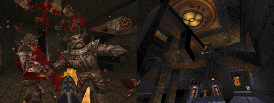
The second divide is the inconsistency in environment designs between the four episodes. As said in the introduction; the game swings between grunge medieval futuristic that it makes the game feel a little cross-crossed in its paths. The enemies cross over from either environment as well.


 Game Design Companion: A Critical Analysis of Wario Land 4 - $7.99
 Level Design: Processes and Experiences
 Speed Boost: The Hidden Secrets Behind Arcade Racing Design - $5.99
 Adventures in Games Analysis: Volume I - $5.99


