XIII Vs Prince of Persia (Next Gen) – Cel-Shaded Comparison
November 12th, 2008
Since it’s popularization with Jet Grind Radio (2000), cel-shading has become an increasingly more popular tool of artistic visual expression within the medium of games. There have been many good examples of the technique but for this article I would like to contrast the works of one company from last generation to now; Ubisoft.
In 2003 Ubisoft released the apt XIII, a first person thriller based around the Belgium/French comic book of the same name. I highly recommend that you sought this title out if you haven’t tried it. Particularly the PC version which runs in a high resolution.
The other game is Prince of Persia, a new iteration of one of gaming’s classic favourites. This title is utilizing the technique to evoke a connection to the original PoP game. It can already be seen from the two main trailers released that Prince of Persia is adopting an extremely striking and intimate feel to its visual presentation.
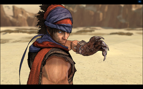
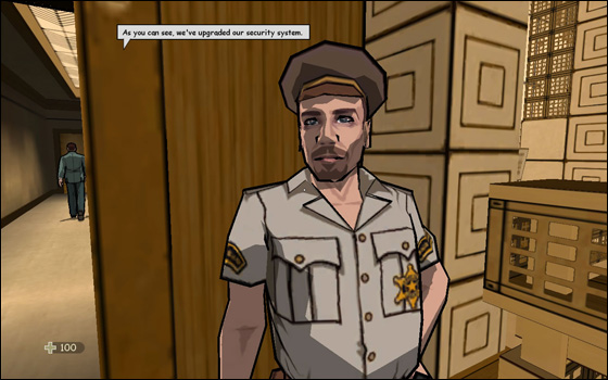
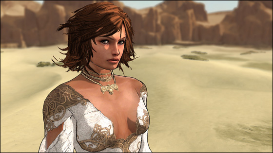
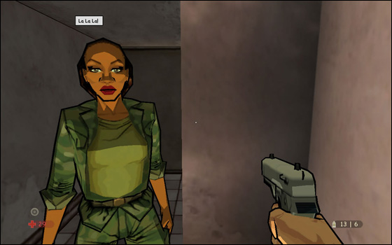
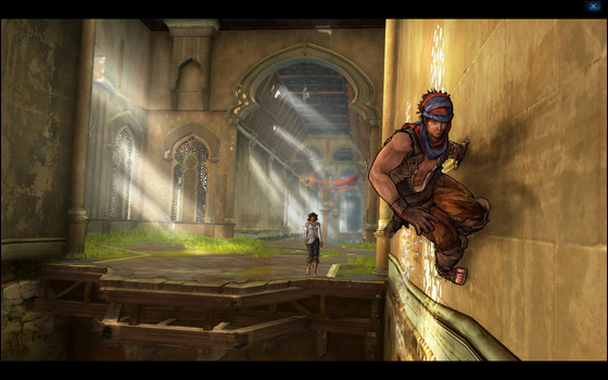
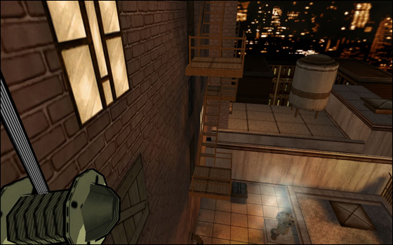
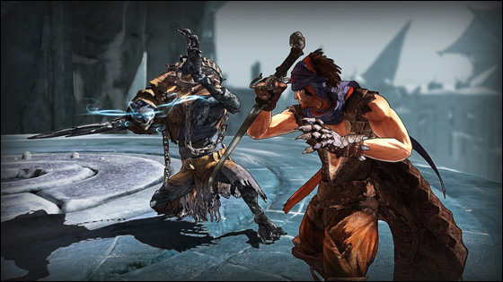
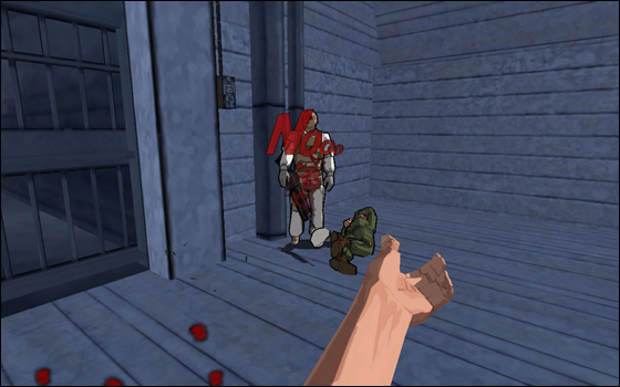
I have collected several screens from both games which can be seen below. It has been difficult to find equivalents since the two games are set in opposite perspectives. Click on the images for high definition.
Beyond the model rendering and polygons, the main difference comes from the application of the technique. Prince of Persia lowers the alpha channel of the shading, allowing richer detail to shine through, giving the game a water colour look to it. This is then enhanced by the blurring and softening of the landscapes in the background. XIII on the other hand uses strict colour fills and some undynamic shadowing effects. The greater rendering power allows Prince of Persia to display much clearer lines around the characters, particularly around the face. Clothing, hair and fabric are also displayed with much better fidelity.



 Game Design Companion: A Critical Analysis of Wario Land 4 - $7.99
 Level Design: Processes and Experiences
 Speed Boost: The Hidden Secrets Behind Arcade Racing Design - $5.99
 Adventures in Games Analysis: Volume I - $5.99


