The Complexities of Castlevania: SOTN – Traversal
December 1st, 2017
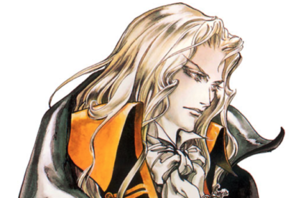
[When developing Castlevania: Symphony of the Night, director Koji Igarashi wanted to make a game which would “overturn player’s ideas about Castlevania, yet also feel like a Castlevania game”. In pursuing this vision, his team made SOTN’s game system much more complex, incorporating RPG systems and a wide variety of nuanced player actions. This series of articles will examine how these additions shape SOTN’s core gameplay of moving through space to dodge and attack enemies.]
When Igarashi’s team were drafting up Alucard’s (the player avatar) ability set, they drew upon the framework established over the course of earlier Castlevania titles. However, the developers also made some alterations and introduced new mechanics which give SOTN its own particular character. I’ve picked out a few details (both new inclusions and series staples) which speak to the way SOTN mechanics and mechanical properties shape the nature of traversal and movement.
- Alucard walks at a constant speed and doesn’t gain momentum, which is appropriate given his relative size within the environment. As such, the player has enough time to see and react to the obstructions as they come into view.
- The player can control the height of Alucard’s jump through the length of button press and so the input has a direct relationship to the on-screen output which allows for a more intuitive sense of control.
- Alucard falls reasonably quickly, and so like the NES Castlevania games the player has little leeway to adjust their jumps in mid-air. In this way, SOTN prompts players to mentally foresee their complete jump trajectory before moving off the ground. For a lack of better word, the players need to play with more intentionality. This is particularly true in boss encounters where bad jumps can punish the player.
- Player’s can upgrade to a double jump with the leap stone relic. The second jump height is shorter than the first. The reason being that fitting two differently shaped pieces together when planning your jumps is a much more interesting spatial challenge than combining two equal halves.
- The extra hop gives the player two levels of added control over the jump. They can choose when to do the second jump and how high to make it. These options facilitate various types of higher level manoeuvres such as floating, high jumping, and hopping. A good amount of gameplay potential can be extracted out of a reasonably simple addition.
- With two jumps, players can also react to any sudden changes in the environment when Alucard’s mid-flight. In this sense, only having the single jump available at the start of the game encourages the player to be more cautious and observe more of their surroundings. Some time later, once the player is more in tune with the dangers of Dracula’s castle, the game provides them the means of better navigating around these dangers.
- Alucard can high jump when the gravity boots relic is equipped. The inputs (press down and up on the d-pad and then jump) make the mechanic distinct from jump and double jump. However, the somewhat particular rules governing the mechanic’s execution (Alucard can perform a high jump when on the ground and after a double jump, but not after a regular jump), cloud the technique with some ambiguity. Also, the screen-high ceilings of Dracula’s castle limit the applications for a jump which stretches two and a half screens tall. The occasional hall or exterior setting provide opportunities for players to use the technique, but pepperings of enemies in these areas restrict these few potential spaces. Furthermore, the bat form allows Alucard to navigate vertical spaces with much more foresight than the high jump. So although the high jump looks flashy, it doesn’t offer much functionality.
- When in the air, Alucard can do an air kick, slicing straight down or diagonally. As with high jump, the particular nature of the mechanic limits its functionality. The player must double jump to perform the technique, which increases the complexity of envisioning the attack and its trajectory in the mind’s eye. In terms of traversal, the diagonal kicks make light work of staircases. Players can also exploit the technique’s rebound (which allows Alucard to enter into another kick) to skim across a series of light fightings or off the heads of a row of enemies. Although highly satisfying, such techniques are too nuanced and the applicable situations too few for the majority of players to incorporate into their repertoire.
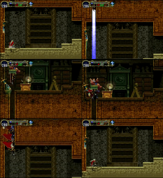
- The back dash is a quick backwards retreat that acts as a dodge move. It’s also a viable, if not unorthodox alternative to walking (and by the looks of most SOTN speed runs, a faster method too). Alucard’s animation state suspends between rooms, making it possible to continuously moon walk your way through the castle.
Overall, we can see that the complexity added to Alucard’s repertoire of traversal mechanics both in terms of the number of mechanics and the complexity of each mechanic lead to more nuanced-driven gameplay. I would argue that very little of the nuance (probably only the extra hop in the double jump) has the ease of use and functional benefit to serve your average play in any meaningful way. (On the contrary, these nuances help buoy the SOTN speedrunning scene). The inclusion of these nuances as well as mechanics with particularly narrow functional purpose clutter SOTNs play experience with unviable options.
3DS Demo Impressions Part #1
April 28th, 2014
Last Christmas, Santa gave me a 3DS. I’d been hoping I’d get a 3DS because Nintendo had their Super Mario 3D Land promotion going, where anyone who registered their system and a copy of 3D Land would get a second game free. A great opportunity to jump on the 3DS bandwagon, and with a new Mario and Zelda game no less. Unfortunately, the eShop was facing connection issues, thanks to the Pokemon Bank outage, so I waited a few days and then downloaded some demos instead. A few months later and I still hadn’t put my notes up onto the blog. So here’s what I played and what I thought:
Metal Gear Solid 3: Snake Eater 3D
- Wow. This game looks amazing in 3D. It seems that the colouring and visuals were modified to make the 3D effect more pronounced. In any case, I noticed snakes, birds, butterflies, and other creatures that weren’t so apparent in the original (maybe more were added?). The 3D also makes it easier to judge the distance between Snake and a guard. Playing Portable Ops Plus for the PSP recently, I would often bump into enemies or attack before I reached them. So I can appreciate this change.
- The camera controls are awful; however, the menus are easier to navigate with the touch screen, and the nestled CQC d-pad commands and other visual prompts remove the need to remember the layers of input complexity that were problematic in the original.
- The other thing about the bottom screen is that it frees up the interface on the top screen while also adding information that is locked behind the pause button in the original. With more intel available, it’s easier to make informed decisions and remain undetected.
- Overall, the 3DS version is a lot cleaner than the original. When I replay the PS2 game later, I’ll have more to say on Snake Eater.
Rayman Origins
Playing in the Shade (console version)
- Visual flourish is valued more than function, and to a fault. This is especially true of Playing in the Shade, where the player must keep wind of a fast-moving target and has less time to read the game world.
- In Playing in the Shade, the strict progression shrinks the space for player expression and puts an emphasis on memorisation and reflex skills.
- In Swinging Caves, there’s a locked cage in a secret room. Later, the same cage appears in the final room, representing the end goal. Given that the first cage is in a seemingly secret room, it’s not clear whether opening either cage ends the level or if only the second cage in the final room ends the level.
- It’s neat how the projectiles in the shmup level can bounce off certain surfaces and how enemies can be sucked up and used as ammo.
- The level arrangements didn’t really gel together or build in any meaningful way, but I’d need to play more of the game to make a clearer statement on this.
- It’s odd how the levels use the 3D effect while the loading screens don’t. The game looks kind of blurry overall.
Denpa Men: They Came By Wave
- I only had enough radio waves in my house to catch two other Denpa Men. This made completing the demo quite tricky.
- There’s far too much automation in the battles. This simple game basically plays itself.
Epic Mickey: Power of Illusion
- Starts off the demo with 5 minutes worth of stills and text, and then another minute of text.
- Adding objects only requires drawing the outline, but removing requires colouring.
- The drawing and erasing mechanics, at least in the demo, are only applicable in pre-set situations to open simple locks and aren’t engaging enough on their own. Zelda: Phantom Hourglass put similar mechanics to better use, with varied and deep applications, years ago.
Castlevania: Lords of Shadow – Mirror of Fate
- No cutscenes or text. Just straight to the gameplay.
- I was originally concerned about the lack of spatial dynamics in the combat, but the jump is high and floaty enough that verticality is significant, and there are enemies that require mid-air attacks.
- The combat is more like a 2D God of War than any of the SOTN-esque games. This is good cause those games were stuffed full of arbitrary systems that didn’t greatly support the core combat.
- To rise above hack and slash convention, though, the whip mechanics should be more dynamic, the secondary weapons should mix up the skill set, and there should be more interplay. For example:
- Physics-based whip swinging. Swinging in the demo is single static move. Momentum could be used to swing through boarded up doorways or to knock enemies over.
- The whip should knock things about in the environment. For example, the lamps at the castle entrance. What about other environmental interactions? How could these interactions be tied into the combat?
- The bomb boomerang adds aiming in 2D space and timed detonation with enemy hit-stun. What about the other secondary weapons?
- I like how blocking at the right time opens up an opportunity to counter. How else can back-and-forth counters be facilitated?
A Few Thoughts on Castlevania: The Dracula X Chronicles – Rondo of Blood Remake
November 24th, 2013
When I was 9 years old, I had my own CD player, which I thought was a pretty big deal. The problem, however, was that when you’re 9 years old, you don’t get a lot of pocket money for CDs. Fortunately my CD player also had a tape deck, so I could record music off the radio. I used to wait for the Top 40 to come on at night and record whatever songs interested me. Sometimes it wouldn’t be until after I listened to a song that I’d realise that I liked it. This meant that I’d have to tune in another day and hope that the same song was still popular and played before bed time. My small collection of tapes, self-made compilations of recorded hits, reflected the music I liked at the time as by means of what was available. Even though the songs were often loosely related—and sometimes released months apart, given that I’d scrub over and replace songs—their grouping together on a single cassette had its own meaning and mythology.
Anthologies and compilations have this unique quality where the relationship between the individual items and the order in which they’re arranged creates its own internal narrative. As a collection of games, Castlevania: The Dracula X Chronicles—which contains Symphony of the Night, Rondo of Blood, and a Rondo of Blood remake, the centrepiece of the collection—draws attention to the Richter Belmont/Alucard story arc, the series’s sweeping transition from branching levels to an open castle structure, and the addition of complex RPG sub-systems.
For me, this compilation puts into focus the way in which certain game elements have or haven’t crossed the gameplay divide. As with most Castlevania games, SOTN and ROB are stuffed full of enemies and level elements copied and pasted from previous games in the series. Seeing how Alucard’s short-range weapons, compared to Richter’s whip, change the dynamics of, say, duelling with a Spear Guard is pretty intriguing stuff—or how SOTN’s sub-systems and open structure allow the player to ride on past an enemy that was, in the prior game, a reasonable test of timing and observation. There really is just too much to talk about when it comes to the Castlevania‘s constantly recycled history of gameplay, so let’s stick to a few key comments then.
- As with all Castlevania games, hearts are the currency of special attacks, not health. This blatant disregard for form fits function drives me crazy.
- It’s nice how Maria, with her mobility and the generous range and duration of her dove attacks, can act as a form of scalable difficulty, but she’s a bit too well hidden for less experienced players to find her.
Rondo of Blood‘s two primary mechanics aren’t very dynamic. Richter’s jump lacks mid-air control and his whip attack can’t be cancelled or modified. (Maria is a bit more flexible with her double jump). Because time is a key game dynamic, as the game is about movement and attacks which occur real-time in space, and the two primary mechanics have long animations that can’t be altered once executed:
- They are high-committal mechanics
- Stress is placed on the player’s understanding of and reaction to the game world
- The gameplay is not smooth and continuous, but fragmented into chunks, thanks to the pockets of inactivity when the player is waiting for Richter to land or reclaim his whip.
The enemies are static challenges, once you’ve got their pattern down and can respond to their openings, the levels become a cakewalk. The problem is that, like the primary mechanics, you have to wait before you can interact (as you observe and pick up on the cues). Sure, memorising an enemy’s movement pattern is more engaging than waiting for Richter to finish off a jump or attack, but it’s still not as engaging as interacting with the game.
Despite these fundamental weaknesses at the heart of the gameplay, the level variation is quite good, perhaps even a high point. Each level introduces its own concept and then builds upon it. The nature of the enemies, where half of them have reasonably long attack cycles, makes it hard to layer more than two or three of them together, putting a cap on the potential for counterpoint.
- It’s possible to attack some enemies from afar by moving just outside their attack range, but keeping them within reach of Richter’s whip. This transforms the combat into a dance off over the all important middle ground.
- The use of particle effects makes it hard to read some hit boxes.
- Some of the game’s secrets require guesswork.
- The 3D graphics and texturing make some areas hard to make out, like stairs.
Speaking of stairs, their behaviour is needlessly perplexing. Stairs that mark the horizontal end of a room are solid. That is, the player can ascend them (forwards/backwards and diagonal direction of stairs) and can jump and land on them. Stairs with an area that continues on behind the staircase are semi-solid. That is, the player can ascend them, but only land on them when pressing the buttons to climb (otherwise the avatar will fall through). Semi-solid stairs are on a layer behind solid stairs, otherwise the avatar wouldn’t be able to walk through them. This begs the question: what does pressing the buttons to climb have to do with moving the avatar back a layer?. The logic is obviously broken, but you can understand the reasoning behind the design: if an enemy’s near a staircase and you want to jump to avoid it, it’s better that you have the option of jumping on and jumping through the staircase, as enforcing just one or the other could be problematic. Surely, though, there’s a more elegant solution. What about keeping enemies away from stairs, not putting stairs over pits, or only using solid stairs?
One of the Castlevania series’s signature elements, light fittings that drop hearts, are just a prompt for the player to repeat the same basic attack, filler that doesn’t advance the game in any significant way. There’s not much fun in strumming the same note over and over again. The lamps could be better positioned to elicit more variety in whip use. Why not remove the light fittings altogether and only offer hearts for defeating enemies? That way, there’s a steady build up of hearts through the course of a level, and thus restricted-to-freer practice is facilitated (the special attacks are a form of freedom as the player can choose which weapon to use and whether to use the whip or the special attack).



 Game Design Companion: A Critical Analysis of Wario Land 4 - $7.99
 Level Design: Processes and Experiences
 Speed Boost: The Hidden Secrets Behind Arcade Racing Design - $5.99
 Adventures in Games Analysis: Volume I - $5.99


