The In-Game Mini-Blog
February 7th, 2009
Note that in my recent write up on Trilby I mentioned:
“Preluding each heist is a narrative scene featuring a block of scrolling text in which Trilby prescribes his thoughts of the events layed before him. The text is sort of like a mini-blog that allows the player to get a feel for current Trilby’s woes and worries. This brief insight is interesting not only because it acts as a free ride for Croshaw to display his fine writing skills but also to build understanding between Trilby’s character and the player.”
I actually wrote that article some months ago and hadn’t really thought about this topic much since then. This past week though I’ve been playing through Syphon Filter: Dark Mirror on the PSP where something within the pre-gameplay mini-blog stuck out and made me reconsider its purpose.
When it comes to narrative the Syphon Filter series (there was a trilogy on the PSone, a PS2 title and two recent PSP installments) has never really been more than the equivalent of a B-grade Steven Segal action flick. Personally, I love Mr Segal’s direct-to-video stuff which is perhaps why I am so fond of this series, but then the mini-blog stepped in and elevated Dark Mirror’s story during the later half of the game. While not a huge narrative crutch it was definitely something that I didn’t see coming.
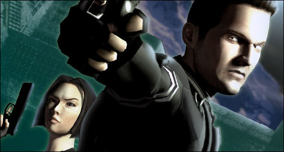
In previous games the pre-gameplay mini-blog (referred to as Mission Briefings) usually contain an outline of the next level from the perspective of the protagonist. Basically they were used as a guise to tutor you on what to expect once the disc loads. In the case of the later half of Dark Mirror, the “Mission Briefings” started to become more of a personal reflection of what the protagonist (that’d be Gabe Logan) was going through. Gabe started to express true feelings about a former lover during the game. While a good deal of this was presented in cutscene format, the more interesting parts were delivered though the briefings text. Over several of the final missions you could begin to see Gabe’s feelings slowly manifested into self doubt and frustration. Gabe’s team mate Lian Xing – who is also playable – interludes Gabe’s conflictions when she becomes playable in her own mission. In her “briefing” she worries over the affects this is having on Gabe and why despite the fact they have been field partners for so long, Gabe never displays an interest towards her.
The emotional context provided in the briefings go on to justify the events that unfold later in the game and since we are slowly drawn into Logan’s mindset his actions seem genuinely believable. In contrast to the usual cardboard gruff that we are use to, this is a significant improvement.
The difference between these sequences in the first and second half of the game is that they are briefings and blogs respectively. The later entries read out as one would imagine the personal blog of these agents read like.
So between the parts that I could see coming, this pinch in the storytelling was effective. I don’t think that it can be billed as anything new, as it’s almost certainly been done before but I think it was worth mentioning before I continue to evaluate the strengths of this title. Beyond Syphon Filter and Trilby I can’t think of anymore examples, but they’ll come in due time.
Super Mario Galaxy Observations #2 Build me a Space Ship
February 5th, 2009

The other point that I wanted to discuss regarding Super Mario Galaxy was its distinct visual flair which I feel was part of a three-game-evolution. It started with Pikmin 2 on the Gamecube, was expanded on by Donkey Kong Jungle Beat and has seen a new dimension in Super Mario Galaxy. All three of these titles were made internally at Nintendo’s EAD division, with Mario and DK Jungle Beat made by the same studio, not too sure about Pikmin though. In anycase, all three games seem to draw from a similarly expanding style guide.
Pikmin 2 fleshed out one of the more neat elements of the original game; pop culture references through the various components of Olimar’s space ship. Stumbling upon a giant battery in the middle of a field trip with your rainbow coloured friends was downright delightful. Pikmin 2 expanded upon this feeling of “oh, wasn’t that a pleasant surprise!” by crafting it into the artistic design. The use of medicine whites, velvet purples featured not only in the two new variations of Pikmin but also in the landscapes themselves which began to move away from just simple gardens to a design which encompassed more of the elements, underground colonies and abstract areas of earth. The giant Pikmin eating bulborbs sprouted fuzzy hair, textile, metallic and merchandise textures were heavily introduced, as too were strong water and smog effects. This culmination of these small design choices gave Pikmin 2 a much more varied, vivid aesthetic over it’s predecessor. Increasing the delightful creativity of the previous game. It’s part abstract, part home made and a bit of nature all thrown together.
DK Jungle Beat drew heavily from Pikmin 2’s tool box but combined it with the Donkey Kong universe and then added it’s own slice of mayhem to create a semi re-imagining of the franchise. With the design premise basically layed out and much of the technology taken straight from Pikmin (fur, water effects), there was a greater emphasis on character design and bridging the multiple components of presentation together to heighten the fruit salad vibe taking place on screen. I use the term fruit salad because the larger than life personality clash in an on screen celebration in all it’s own craziness.
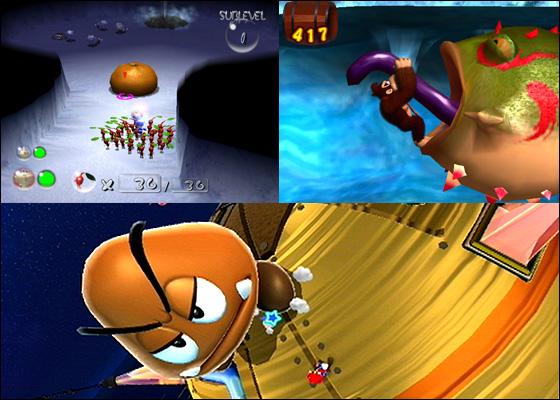
Character design, animation, effect and colour choices amplifies prominent features. The way Donkey Kong swings his fist exemplify his more primal, aggressive undertones. The weak point of enemies (particularly bosses) stick out in the character design and once they’re exposed yell “HIT ME!” with a panic of colour and animation. The levels themselves feel like extensions of Pikmin’s design with DK battling the elements. This time around though, the texture set patterning those elements has expanded into soils and woods and gives the game a natural, home-made feel to it.
With Jungle Beat the texturization, colour and animation quirks have all been adapted but they appear in full force to style the eccentric nature of the game. As such, the graphic design is integral to the experience and in this stage of the “evolution” the original style guide has become fully developed due to the heavy reliance Jungle Beat placed on it.
And then we arrive at Super Mario Galaxy which tones down the craziness to a more appropriate level while still being a showcase of this new found flair. Mario Galaxy draws two main features from the design toolbox being the textures and characterization. Perhaps the biggest asset that Galaxy brings with it is, more so than the others is how the textures affect the feeling of play. For example, when you walk over various textures the aesthetic matches the feeling of Mario traversing those textures. Soft grass feels as soft as it looks, Mario movement is matched along with the stir of dust from his gentle steps. Character design is similarly inspired, with more creative larger than life characters, personified more so than prior games.
While the design in Mario Galaxy is important, in contrast to Jungle Beat it takes a subsidiary approach to other innovations such as the planets, spherical walking, gravity and so forth – while at the same time the visuals obviously feed into everything the game outputs.
Overall, these three games (and there are undoubtedly other influences) have created an interesting graphical tool set for Nintendo to utilize. Such an approach to design can be seen moving out in other directions such as Little Big Planet.
Super Mario Galaxy Observations #1 Bite Sized Design
February 2nd, 2009

I’ve been playing Mario Galaxy on and off since it’s release over a year ago and have reached a total of roughly 70 stars. What I love about Mario Galaxy is the flexibility it offers the player. Starting any new game requires a certain amount of investment, such as time, energy and commitment to continue playing. Mario galaxy is great in that the demand/reward ratio is very lenient. You can load the game up, walk to an area and earn yourself a quick star in literally less time than 5 minutes. Of course, there are larger levels too which last closer to 15 minutes.
What I find most interesting about this is that such a technique (of breaking a larger game into bite sized chunks of play) is usually reserved for portable titles, where the hardware itself is suggestive of the play habits of the player. I mean, handheld consoles are portable, so it’s assumed you’ll obviously be playing it on the run (not that I ever do, I move my consoles around more than the portables) therefore games are designed with this intention in mind.
Mario Galaxy in this regard is quite forward thinking as I feel it’s scratching a very annoying itch for many players. The game has a no commitment, jump in/jump out vibe to it while not streamlining the qualities of a fully fledged game experience. This for a lot of players is a breath of fresh air; for people like me who need a quick burst of fun between, the high investment titles and other players who have little room in their life to play more than 30 minutes at a time.
The reason why I haven’t finished this game – even a year after release – is that it works so well a quick pick-me-up whenever I feel like a bit of fun. It’s like the bottle of wine or vintage cheese you only bring out on special occasions.


 Game Design Companion: A Critical Analysis of Wario Land 4 - $7.99
 Level Design: Processes and Experiences
 Speed Boost: The Hidden Secrets Behind Arcade Racing Design - $5.99
 Adventures in Games Analysis: Volume I - $5.99


